Brand Guidelines Summary
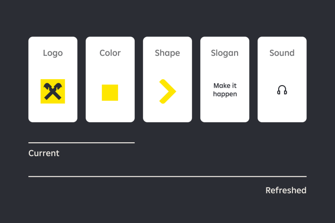
Make one brand happen
We have a very strong brand. However the iconic gable cross and distinctive yellow were the only unifying elements until 2023. To strengthen the brand, enable efficiencies and ensure effectiveness we follow an evidence-based model: we create a consistent brand experience through leveraging existing distinctive assets, implementing new ones, and using them consistently across all touch points.
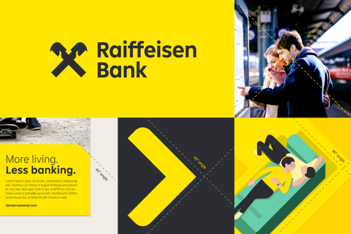
Make our identity happen
While some companies have logos, we already have a distinctive icon. Based on the Gable Cross, we created the foundation to the whole identity: our brand shapes, illustrations, photography style, and all other elements follow the iconicity of our most distinctive asset by referring to diagonal lines throughout all layouts.
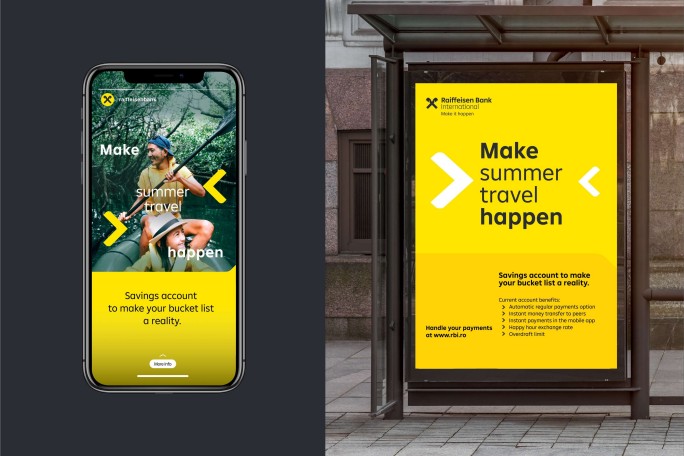
Make it happen
Our communication concept revolves around a core thought: ease. As the safe and reliable bank (from Austria) we support you with simple and excellent service in every interaction, superior digital solutions and stress-free experiences to give you ease to progress in your life.
Make it happen.
Core design elements
Logo
Raiffeisen stands for security and stability. This is also symbolised by our trademark. The gable cross was originally a symbol for a protected house and used to be added to the roof gable to protect the occupants against all dangers.

Logo Primary
Our primary logo is a combination of two key elements, the Gable Cross itself and our Wordmark. These elements are formed as a lock-up and should, where possible, be used together.

Gable cross
While the primary logo should always be our preferred option, we can also use our Gable Cross as a shorthand when required.
Where space is restricted, like social media, signage or app icons, a shorthand logo can be used.
It should also always be attributed to our primary yellow.
Downloads
Color palette
Based on a unified brand identity for RBI Group, we use three slightly different color proportions for our masterbrands Raiffeisen Bank, Raiffeisen Bank International and Raiffeisen Digital Bank, to tailor to the respective target groups.Please be sure to use the color palettes consistently according to the rules in the full guidelines.
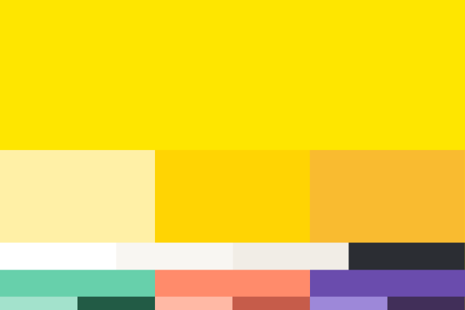
Our color palette is separated into a hierarchy, consisting of three different levels.
Our infographic and illustration palette is a broader set of colors to allow for flexibility and contrast when used in more complex data visualisation and illustrations.
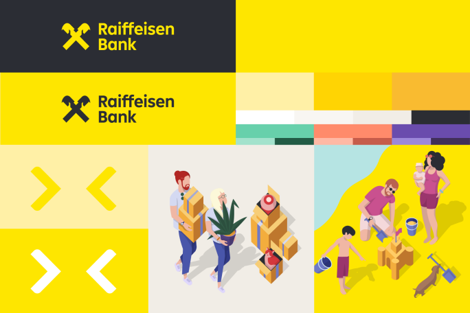
Colors Raiffeisen Bank
Our color palette consists of different levels with a hierarchal approach to color usage. The primary palette is made up of our core tone, primary yellow. It is supported by three additional yellows to add warmth and depth in application. We have a primary mono palette which helps to add depth and warmth across the identity. The secondary palette is used to add vibrance to our communications and is used as an accent to our primary palette. Together our palette is designed to work harmoniously with our core yellow which is one of the most important equities for our brand.

Colors Raiffeisen Bank International
Our palette retains the same proportion of our primary and tonal yellows as our retail vertical. This is to create consistency and harmonise the verticals and build connection. Our secondary palette builds tonality through our warm greys, white and off-black. We elevate our green palette for our corporate vertical. This provides an opportunity to build distinction for the corporate vertical, adding a richness and sophistication in application whilst conveying our ESG credentials.
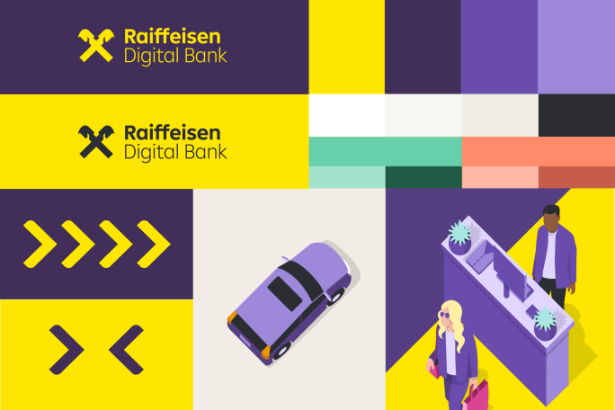
colors Raiffeisen Digital Bank
We elevate purple from our retail bank’s secondary palette to build distinction for Digital Bank. Complementing our RBI primary yellow, it balances emotion and richness while acting as a signal for the world of digital and tech. Our secondary palette builds tonality through our warm greys, white and off-black. We use our green and coral palette to add greater diversity to our applications and help to signal products and services.
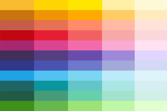
Colors Infographic and illustration palette
Our tertiary level palette is made up of a greater spectrum of tones, including those from our secondary palette. This color palette adopts a greater spectrum of colors and tones which is to be used specifically for illustration and infographics. The breadth in color allows for more complex and interesting data visualisations and illustrations as well as allowing for tonal combinations.
Downloads
Typography
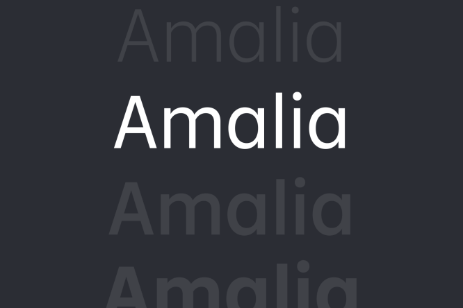
We have a single typeface which we apply across our brand. Meet Amalia.
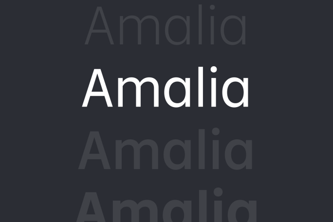
Amalia
Amalia is a typeface rooted in geometry with subtle humanistic influences that creates an ownable and functional design. Its large x-height and design details support legibility, while its broad range of weights offer a flexible typographic palette for creating striking layouts in all sizes.
Usage of other fonts than Amalia is prohibited unless technical reason is provided and appropriate enterprise license is assured.
Decentraland
Experience the refreshed brand in an immersive way in our Metaverse-Pavilion in Decentraland.
Full guidelines
It is mandatory to follow the new brand guidelines as of May 2023.
Please fill out the form below to request access to the full guidelines.
We trust you to use all elements defined in the guidelines consistently and in case you have questions use the brand guardian service in the Brand & Content Marketing team to get feedback or validation.
And now, have fun creating.
Request for access to full guidelines
Please fill out the form for a full access to the guidelines. It includes detailed instructions and editable email, website, PPT, advertising templates. In case of questions please contact Brand & Content team. We are also having weekly office hours where we can support you in learning and applying the new rules.
